Skip to content
All work
Mobile

GlimpseGems

A city's hidden places — found by mood, saved, and shared with friends.

Role
Product design and full-stack development
Timeline
2025
Stack
  • React Native
  • TypeScript
  • Supabase
  • Tailwind CSS
  • Geospatial filtering
Links
Not publicly available

The problem

What was broken, for whom

Recommendation apps are good at showing you what's popular; they're worse at matching a place to a mood. Wanting somewhere quiet to focus, somewhere romantic, or somewhere to celebrate is a different search than 'restaurants near me' — most apps don't have a category for it.

Context

Constraints that shaped it

GlimpseGems is a location-based discovery app built around mood rather than cuisine or price. The product bet is that people already know how they want to feel on an outing before they know where they want to go.

My role

What I actually did

Product design and full-stack development — the entire flow from onboarding through to a saved, shareable collection.

The solution

What I built

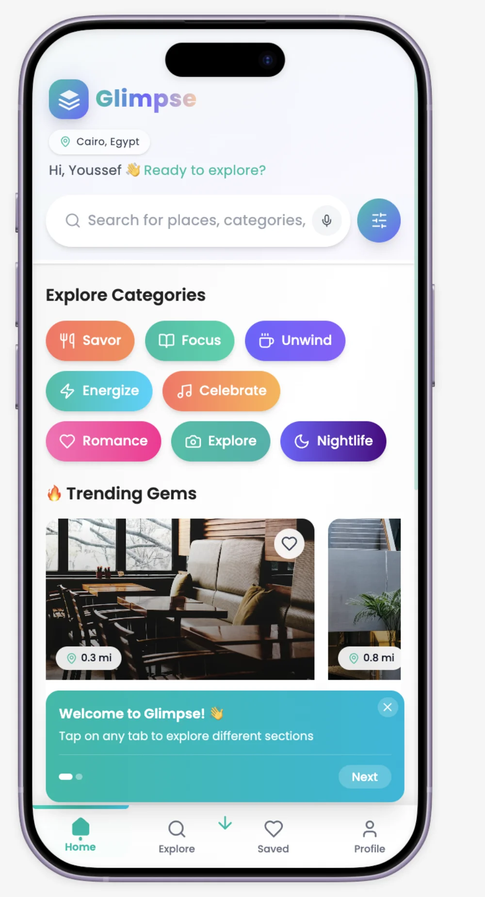
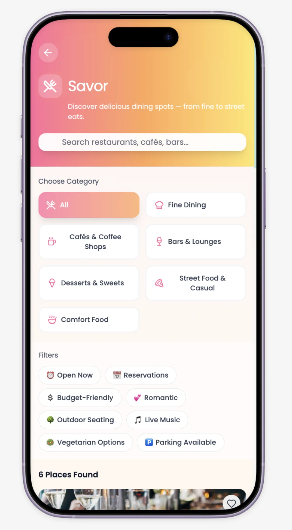
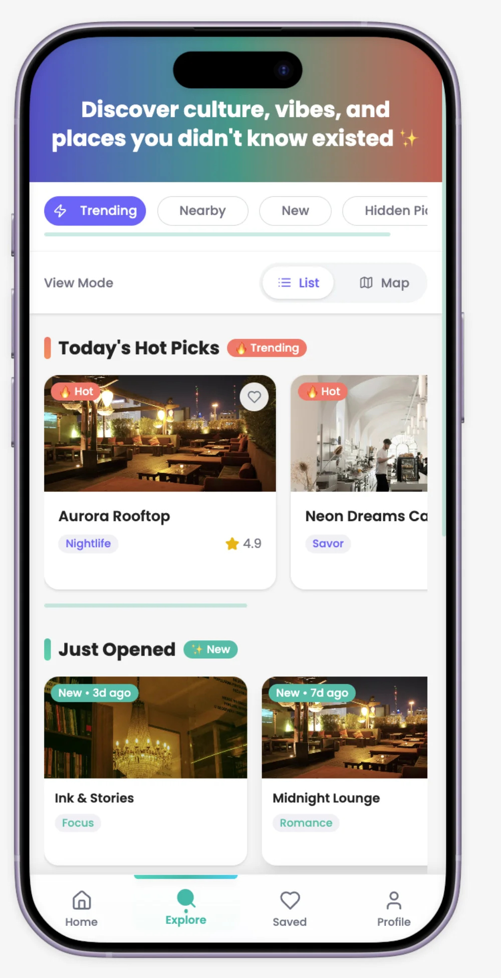
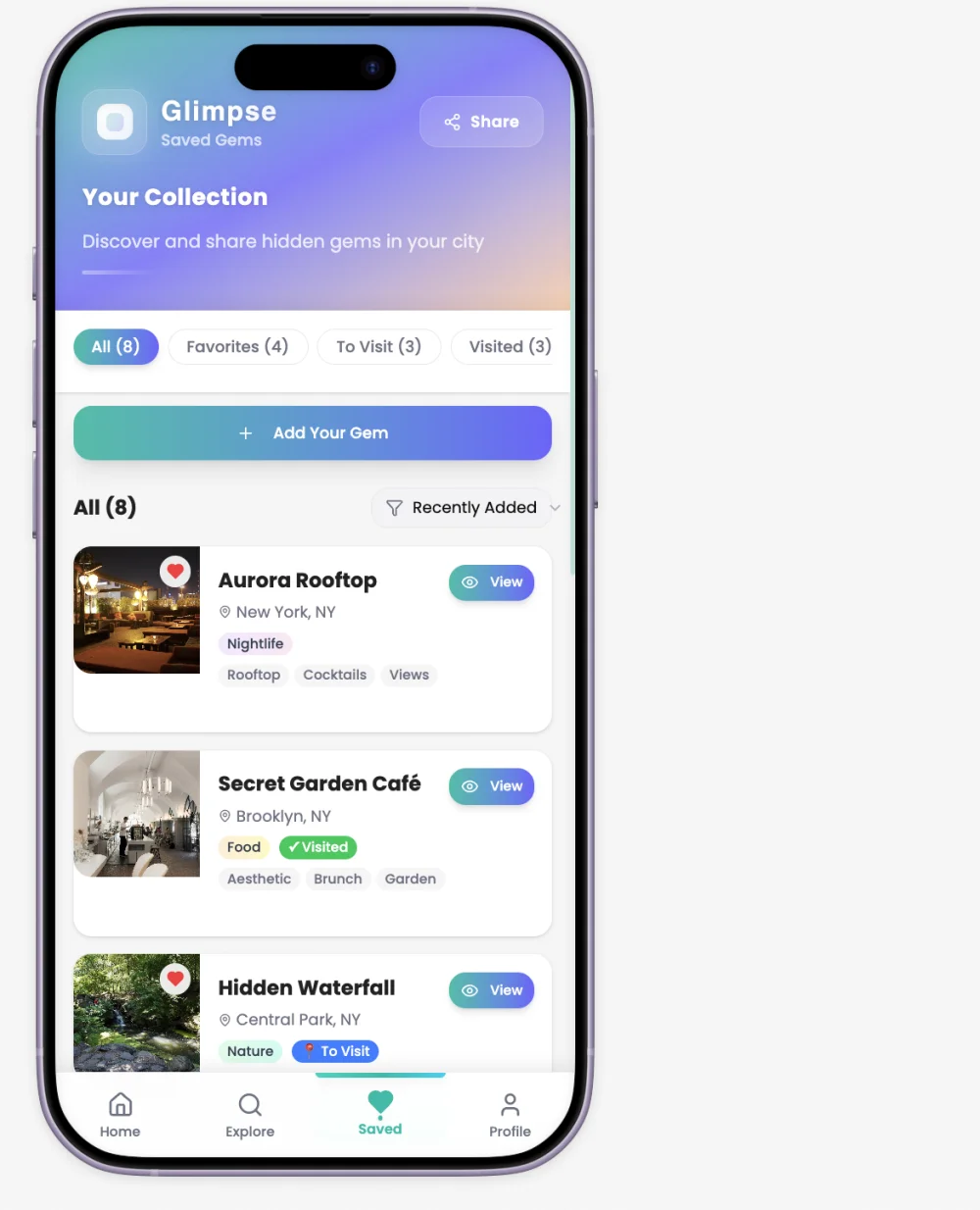
A React Native app on Supabase: social or email sign-in, a home screen organised around seven mood categories (Savor, Focus, Unwind, Energize, Celebrate, Romance, Nightlife) plus a general Explore, and a category deep-dive with real filtering — cuisine type, budget, live music, parking, and more. Explore supports both a list and a map view, with 'hidden picks' surfaced separately from trending places. A Saved section tracks each place's state — Favorites, To Visit, Visited — so a list isn't just a bookmark pile, it reflects where a user actually is in deciding to go somewhere.

Decisions

Trade-offs made on purpose

  • Modelled saved places with explicit state (Favorites / To Visit / Visited) instead of a single flat 'saved' list, because those are three different intentions — wanting to remember a place, planning to go, and having already been are not the same action and shouldn't share one bucket
  • Split Explore into list and map views rather than picking one, because deciding 'what's nearby' and deciding 'what looks interesting' are genuinely different tasks — a map answers the first, a ranked list answers the second
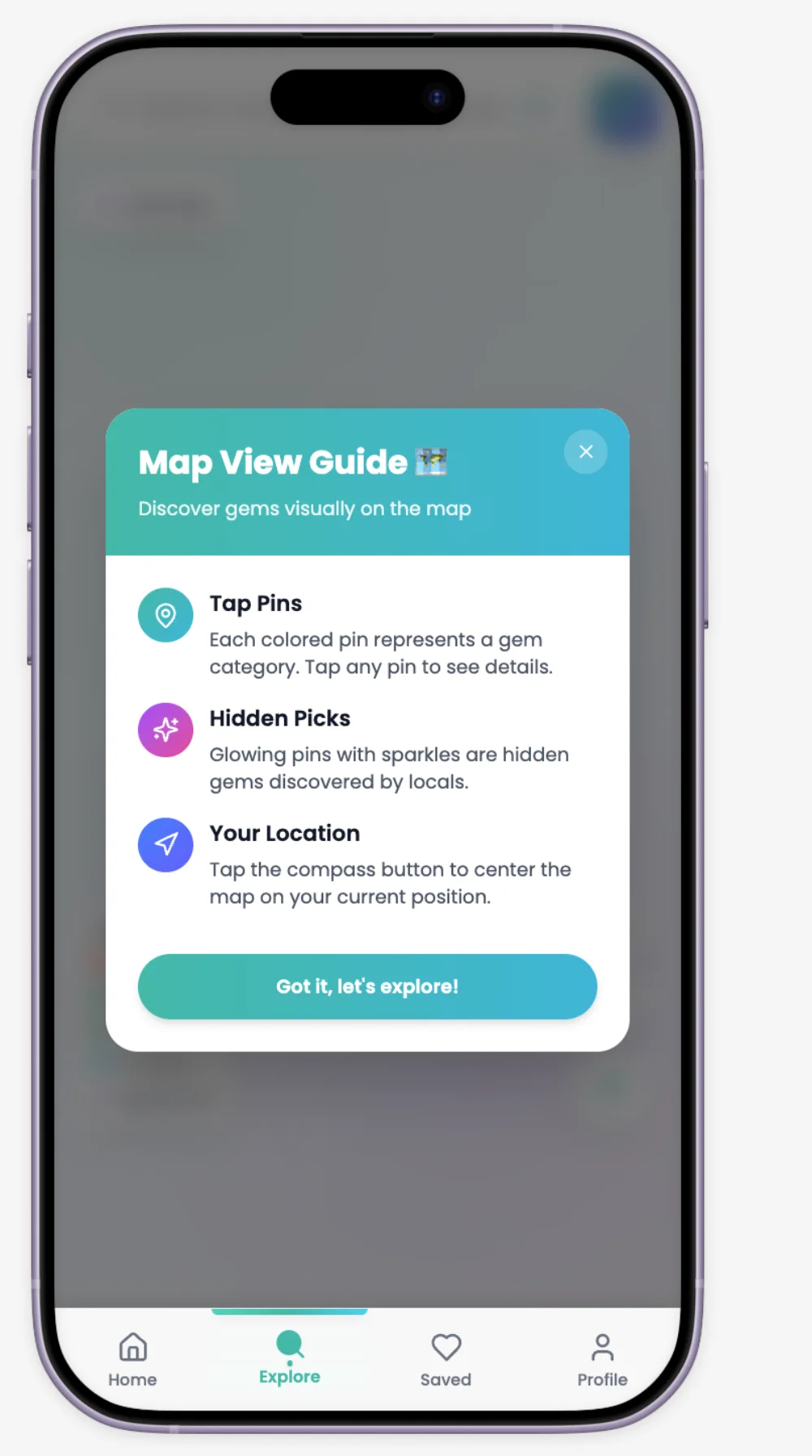
  • Added a short coach-mark onboarding tour on first use of Explore rather than a long tutorial up front, so the map's less obvious affordances (glowing pins for hidden picks, the recenter button) get explained exactly when a user would otherwise be confused by them, not before
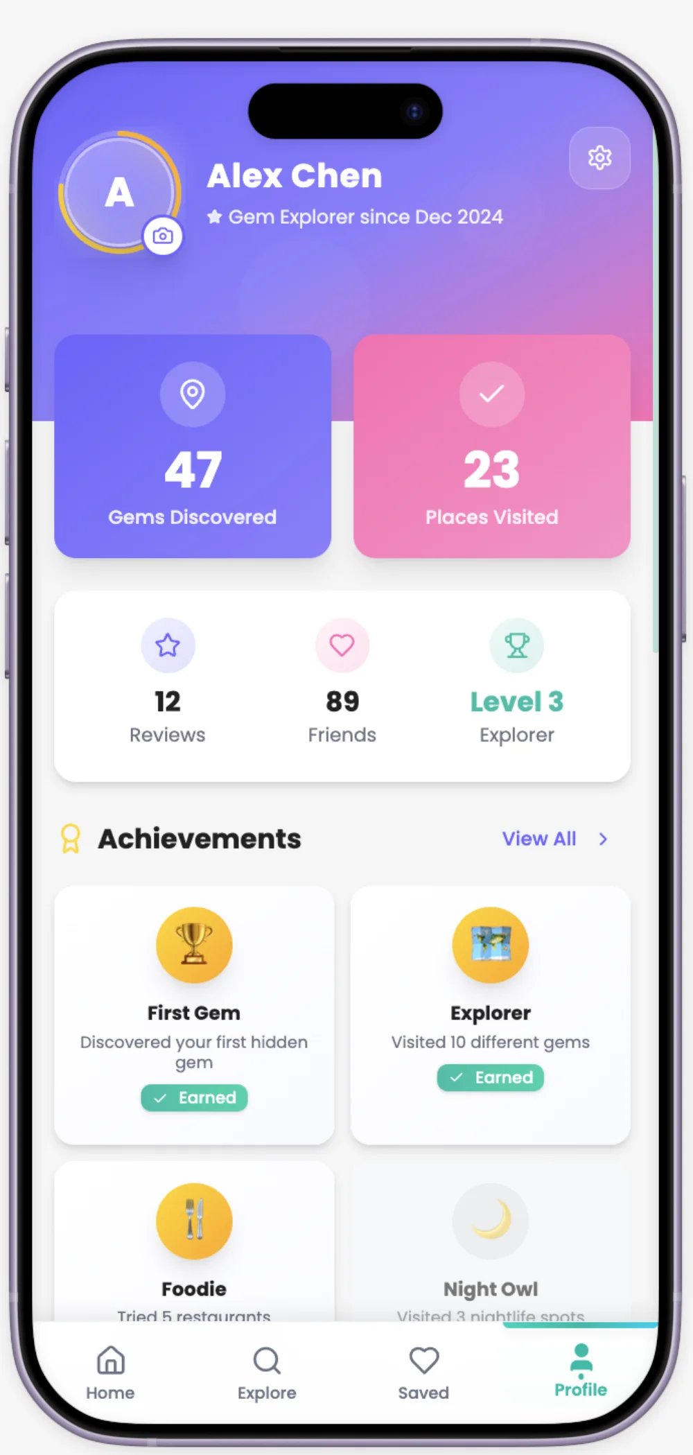
  • Gave achievement badges a visible locked state instead of hiding unearned ones, because showing what's still achievable is part of what makes a gamification layer feel like progress rather than a hidden scoreboard

Stack

What, and why

React Native
one codebase for the whole app, native performance for map interaction and gestures
Supabase
Postgres, auth and geospatial queries without standing up a separate backend service
Tailwind CSS
kept the mood-based category system visually consistent — seven categories with seven colour identities, defined once as tokens rather than hand-picked per screen

Challenges

What broke, and what I'd change

  • Seven mood categories is a lot of surface area to keep visually distinct without the app looking chaotic — the category colour system had to carry meaning (Energize reads differently from Unwind) while staying inside one coherent palette. That balance took more design iteration than any single screen
  • Save-state modelling (Favorites / To Visit / Visited) is simple to describe and easy to get wrong in the data model — a place needs to be able to hold more than one state at once (favorited and visited), which shaped the schema more than I expected going in

What I learned

The takeaway

Onboarding that explains a feature at the moment it's needed, instead of up front, is more work to build — you need state to know what the user hasn't seen yet — but it's the difference between a tutorial people skip and one that actually lands.

Gallery
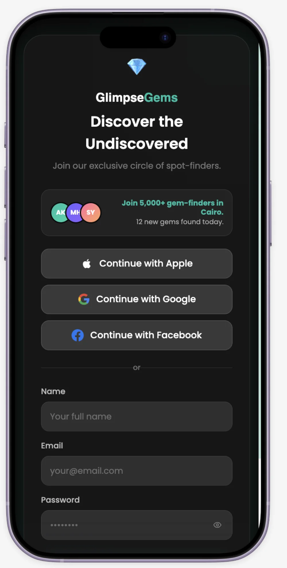
GlimpseGems sign-in screen with social auth options
01Sign-in — social auth first, email as a fallback
GlimpseGems home screen with mood-based category chips
02Home — seven mood categories, not a cuisine filter
GlimpseGems Savor category with filters
03A category deep-dive with real filters, not a search box alone
GlimpseGems Explore screen with list and map toggle
04Explore — list and map are different tasks, so both exist
GlimpseGems map view onboarding guide
05A coach-mark guide explains the map exactly when it's needed
GlimpseGems saved collection with Favorites, To Visit and Visited states
06Saved places carry real state, not just a bookmark flag
GlimpseGems gamified profile screen with achievement badges
07Profile — achievements show locked states, not just earned ones

More work

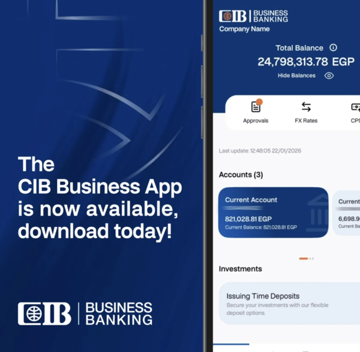
CIB Business Banking mobile app showing account balances and quick actions
Fintech

CIB Digital Banking

Payment features that clear compliance and ship to a national bank's customers.

  • Node.js
  • NestJS
  • REST API design
  • React
  • +3

Read case study

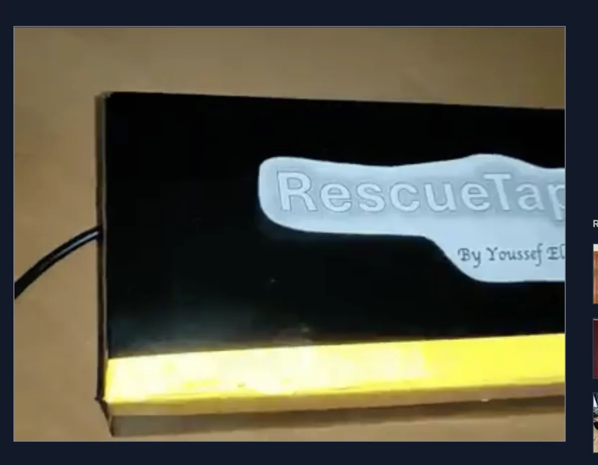
RescueTap wearable enclosure, hand-labelled prototype
Hardware & IoTHonorable Mention — ETH Zurich

RescueTap

One tap — or a detected fall — sends a caregiver your exact location.

  • Python
  • Raspberry Pi 4
  • MPU-6050 / I2C
  • Twilio WhatsApp API
  • +2

Read case study

Contact

Have a problem worth solving?

I'm open to Software Engineer and Product Engineer roles — remote, or relocating. Based in Cairo, EET (UTC+2).